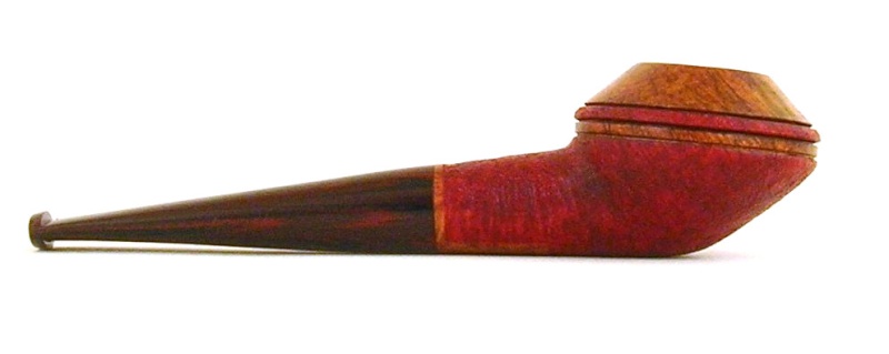
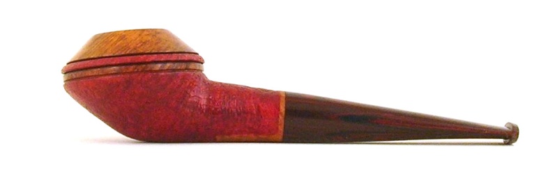
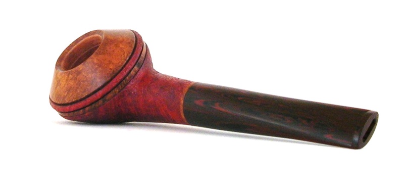
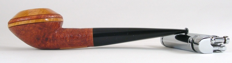
Squat Bulldog

Want to show you work to the world? Want a place to post photos of your work and solicit the opinions of those that have gone before you? Post your work here.
Post Reply
scotties22
Posts: 1767
Joined: Mon Jun 11, 2012 9:43 pm
Location: Missouri
Contact:

Squat Bulldog

Post by scotties22 »

French Briar
Cumberland stem

Length: 5.56"
Height: 1.43"
Width: 1.82"
Chamber: .75" x 1.08"
Weight: 42 grams

The pictures are a little grainy....need to break down and get a better camera.

Image
Image
Image
Image
Am I Calamity Jane or Annie Oakley??...depends on the day.
www.ladybriar.com
LatakiaLover
Posts: 3120
Joined: Sun Sep 02, 2007 4:29 am
Location: Kansas City, USA
Contact:

Re: Squat Bulldog

Post by LatakiaLover »

Check the top and bottom lines of the stem (meaning in profile) with a steel straightedge. Hold up against a bright background/wall. You haven't gone too low anywhere, but there are still a few high spots.
UFOs must be real. There's no other explanation for cats.
scotties22
Posts: 1767
Joined: Mon Jun 11, 2012 9:43 pm
Location: Missouri
Contact:

Re: Squat Bulldog

Post by scotties22 »

I see it now that you pointed it out, damnit!! I'll fix it before I put it in the mail tomorrow.
Am I Calamity Jane or Annie Oakley??...depends on the day.
www.ladybriar.com
User avatar
RadDavis
Posts: 2693
Joined: Thu Nov 23, 2006 8:00 pm
Location: united states/Alabama
Contact:

Re: Squat Bulldog

Post by RadDavis »

For me, the color changes are off putting. Just because you can do something doesn't mean you should.

Hope this helps.

Rad
User avatar
WCannoy
Posts: 542
Joined: Thu Nov 15, 2012 6:58 pm
Location: Lakeland, Florida
Contact:

Re: Squat Bulldog

Post by WCannoy »

RadDavis wrote: Just because you can do something doesn't mean you should.
+1

An excellent lesson to learn!
scotties22
Posts: 1767
Joined: Mon Jun 11, 2012 9:43 pm
Location: Missouri
Contact:

Re: Squat Bulldog

Post by scotties22 »

I made one of these a while back and the piece of briar was almost white. The contrast looked a lot better on the first one. This was a commission and the customer picked (the bottom is a lot redder than the first) the colors. I think had I not put an undercoat on the top of the bowl (which I did not do on the first one) it would not look so muddy. Here is the first one I made back in May.


Image

Rad, You have given me this advise before....probably this time last year on a little apple I carved a faux band around the shank on. I do TRY to remember what you said.....but, I'm a hard headed asshole and a woman :wink: Seriously though, thanks. My husband will tell you that I have NO fashion sense and can't match or contrast colors without something clashing horribly. He even went as far as picking paint colors and decorating the house :lol:

I write all of this to tell you that I do NOT consider myself an artist and want the honest truth about my work. My feelers don't hurt easy at all and I don't ever want anyone to pull their punches. And I wasn't trying to justify or defend my color decisions.....just giving you the back story, so to speak. Hearing the hard stuff is what makes me a better carver......
Am I Calamity Jane or Annie Oakley??...depends on the day.
www.ladybriar.com
User avatar
Ocelot55
Posts: 1639
Joined: Thu Nov 10, 2011 12:31 pm
Location: Columbus, OH
Contact:

Re: Squat Bulldog

Post by Ocelot55 »

Scottie, to me the earlier one you did is much more elegant. I think this has to do with the weight still on top of the shank. Your earlier example does not taper that drastically, and there is a well defined transition on the back of the bowl (front for Tyler and crew).
User avatar
d.huber
Posts: 2691
Joined: Mon Dec 12, 2011 9:28 pm
Location: Durham, NC
Contact:

Re: Squat Bulldog

Post by d.huber »

There are a few places where this version gained some unnecessary weight, IMO. The sandblasted ring breaks the lines of the bowl and there's some extra meat on the top of the shank where the shank and bowl meet. The second issue could be easily corrected several ways (and likely more than I'm listing here): 1. Make the shank closer to the original, in effect raising the widest point on the bowl; 2. Make the shank thicker so that it meets the bowl at its widest point (not sure this would look great); 3. Get your needle file into that crevice.

The widest point on the bowl is undefined, like you tried to stack the rings. No matter how many rings you cut in the bowl of future rhodesians, I'd recommend tapering the top and bottom of your bowl to a shared line which goes all the way around the bowl. This line can be hard or soft, but should be an apparent spot on the bowl where your eyes can transition from the lower lines to the top lines comfortably.

Exhibit A:

Image

Exhibit B:

Image
http://www.dshpipes.com

"Strive for excellence, not for what someone else accepts."
-Tyler Beard
User avatar
RadDavis
Posts: 2693
Joined: Thu Nov 23, 2006 8:00 pm
Location: united states/Alabama
Contact:

Re: Squat Bulldog

Post by RadDavis »

scotties22 wrote:I made one of these a while back and the piece of briar was almost white. The contrast looked a lot better on the first one. This was a commission and the customer picked (the bottom is a lot redder than the first) the colors. I think had I not put an undercoat on the top of the bowl (which I did not do on the first one) it would not look so muddy. Here is the first one I made back in May.


Image

Rad, You have given me this advise before....probably this time last year on a little apple I carved a faux band around the shank on. I do TRY to remember what you said.....but, I'm a hard headed asshole and a woman :wink: Seriously though, thanks. My husband will tell you that I have NO fashion sense and can't match or contrast colors without something clashing horribly. He even went as far as picking paint colors and decorating the house :lol:

I write all of this to tell you that I do NOT consider myself an artist and want the honest truth about my work. My feelers don't hurt easy at all and I don't ever want anyone to pull their punches. And I wasn't trying to justify or defend my color decisions.....just giving you the back story, so to speak. Hearing the hard stuff is what makes me a better carver......
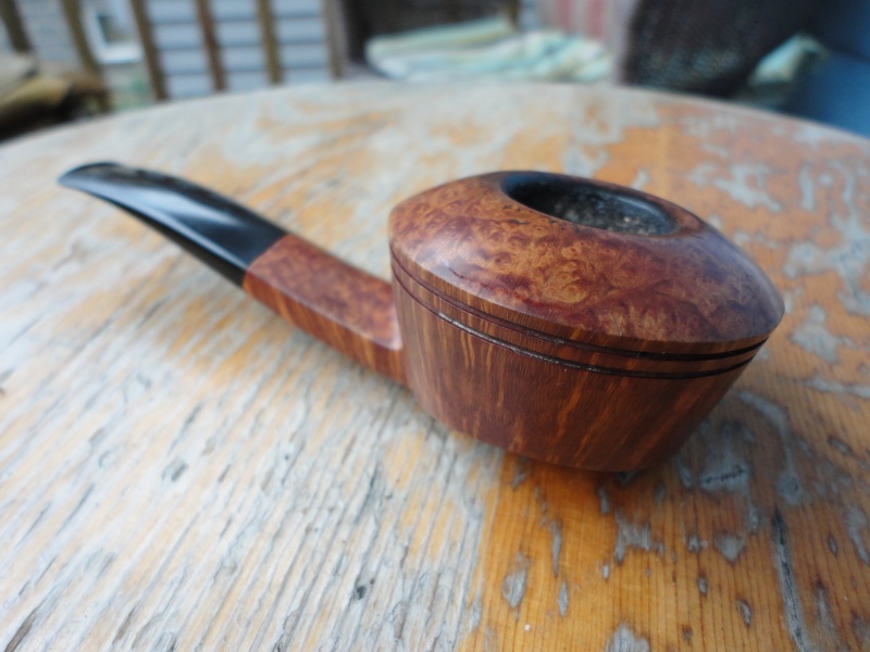
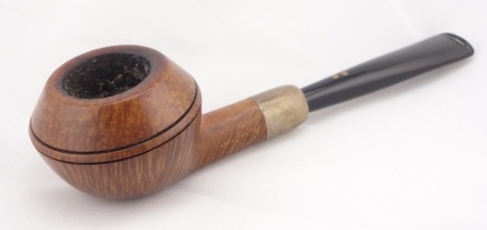
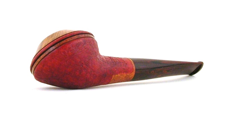
That one looks better, but the color changes still look all gimmicky. Most times, especially with pipes, "less is more". :)

Rad
Post Reply