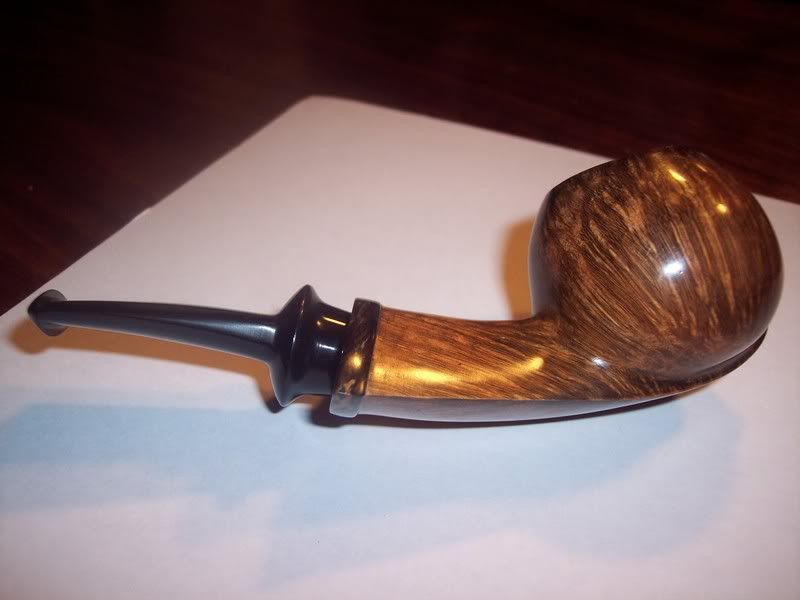
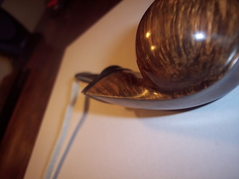
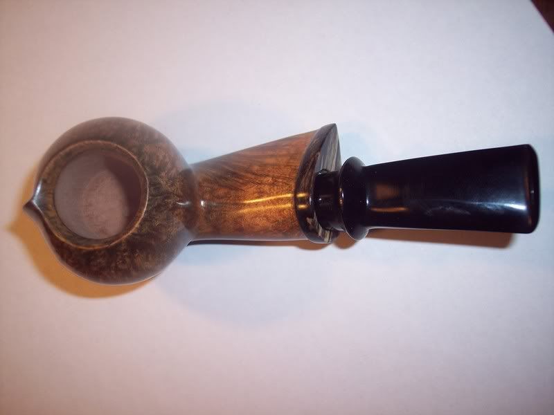
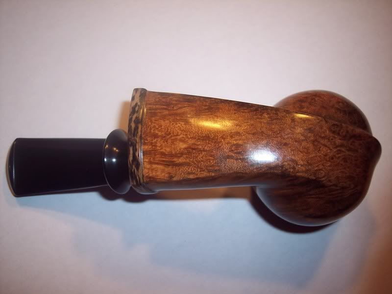
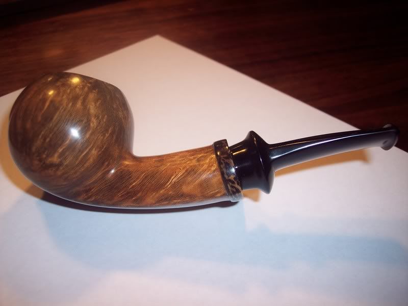
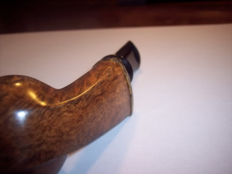
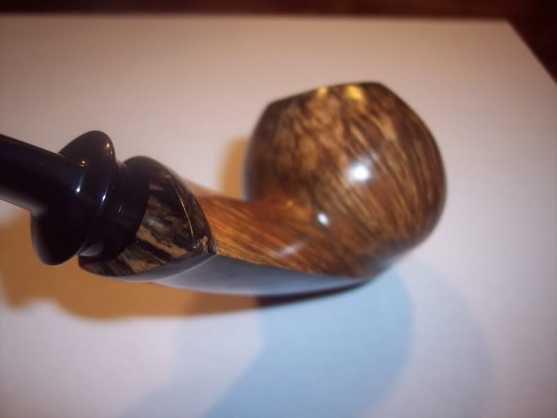
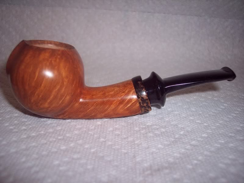
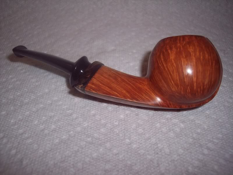
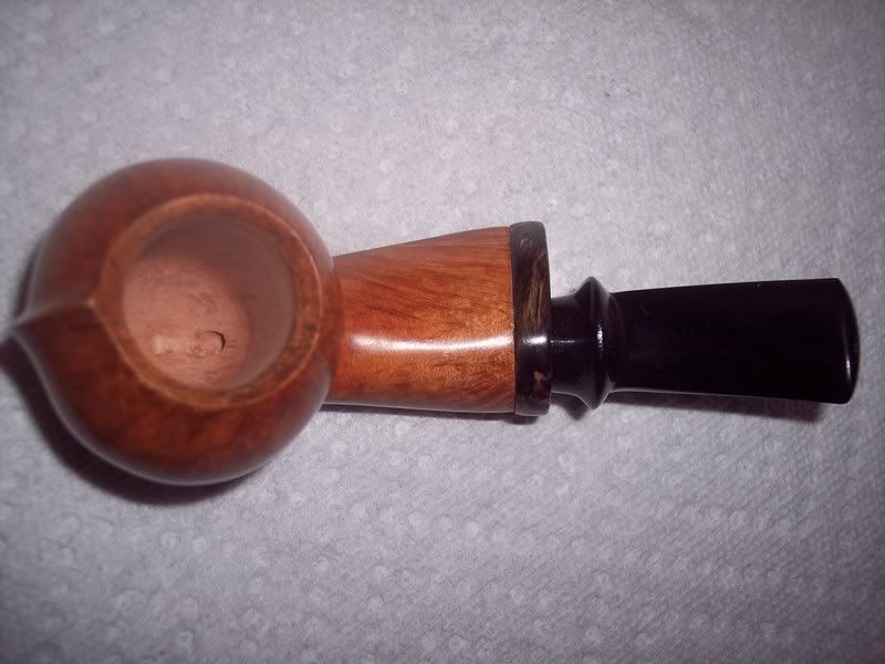
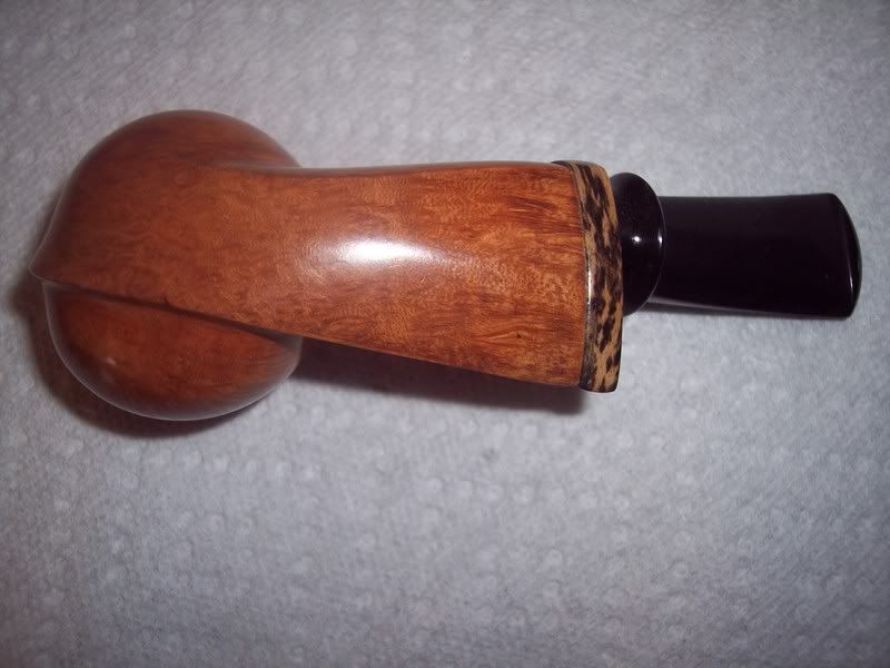
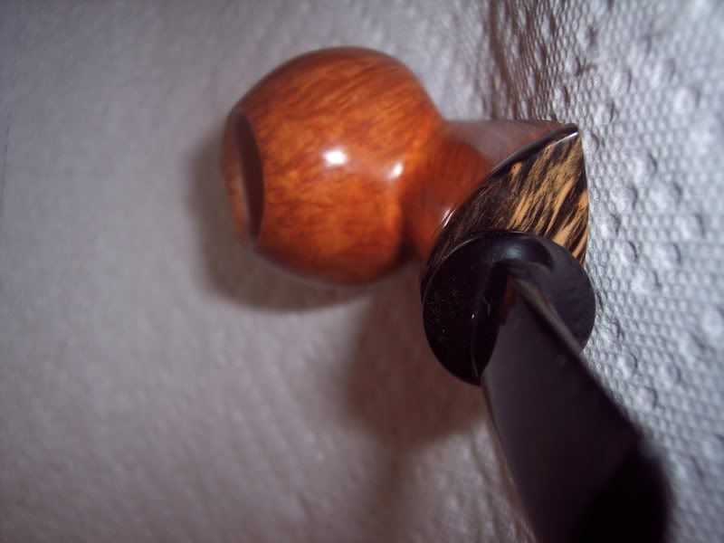
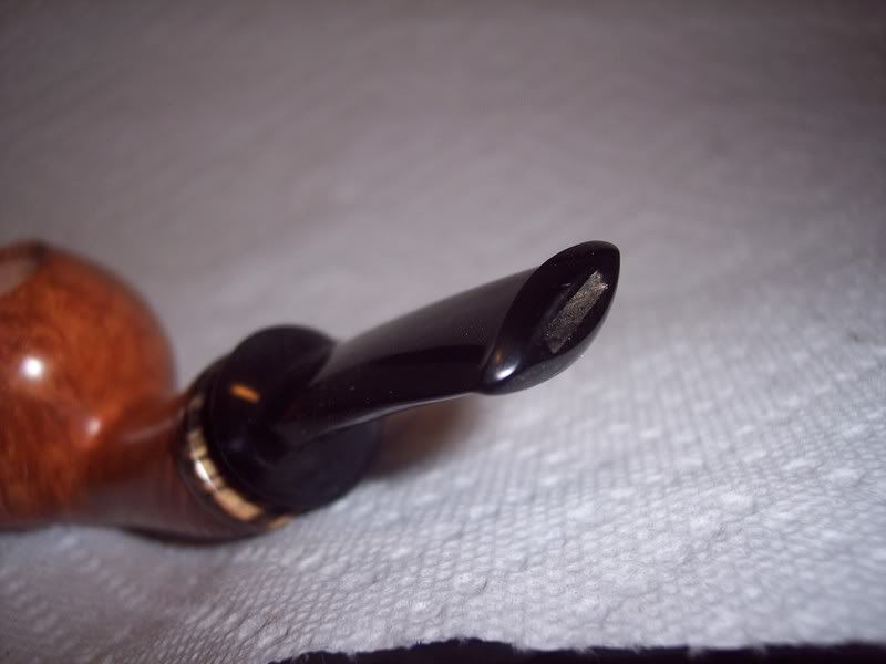
No. 10 please critique

Want to show you work to the world? Want a place to post photos of your work and solicit the opinions of those that have gone before you? Post your work here.
Post Reply
pennsyscot
Posts: 223
Joined: Thu Jun 26, 2008 5:03 pm
Location: pennsylvania USA

No. 10 please critique

Post by pennsyscot »

Here is my tenth effort at pipemaking. I know that I should probably stick
to the traditional shapes since I'm a rook. The pipe is ebonite and ebony with a delrin tenon and mortise sleeve. I'd appreciate any comments or suggestions. I'm aware that this pipe is a long way from perfect. So no need to sugar coat your remarks. Thanks for lookin, Scot
Image
Image
Image
Image
Image
Image
User avatar
Frank
Posts: 1341
Joined: Thu Nov 23, 2006 8:00 pm
Location: Southern California

Post by Frank »

I like the overall design shape you are going for on this pipe.

You've managed to get a very nice, but not great, grain contrast.

I mean this in the kindest way possible, but you should have read Todd's article/thread on how to obtain a well fitting shank ring. Perhaps you started this project prior to his article. I'm sure you noticed how the shank is rounded over next to the ring, instead of continuing the straight line of the shank. Also, it looks as if the shank ring can't decide whether it wants to be flush with the shank, or to stand proud. In my opinion, the ring would look better if it extended further out from the shank and was radiused, rather than flattened.
Regards,
Frank.
------------------
Grouch Happens!
People usually get the gods they deserve - Terry Pratchett
pennsyscot
Posts: 223
Joined: Thu Jun 26, 2008 5:03 pm
Location: pennsylvania USA

Post by pennsyscot »

Frank, thank you for taking the time to reply. Your insiteful criticism is appreciated. The rounding over at the end of the shank dose look terrrible. I didn't realize how bad it was until I saw the photos. I do feel foolish for not following Todd's advice, but, I was about half way through when I'd seen his post. Although it will be difficult, I've decided to try and correct it. It will be hard to improve since the ring is already epoxied in place. Maybe I can clean it up a little. If it gets any better I'll post some pics of my revision.
User avatar
KurtHuhn
Site Admin
Posts: 5326
Joined: Thu Nov 23, 2006 8:00 pm
Location: United States/Rhode Island

Post by KurtHuhn »

Overall, this is a pretty well put together piece. Frank mentioned the one thing that I would really take issue with (shank/cap transition).

The shank cap, at least for me, could stand to be thinner. Maybe by about 30% or so. Looking at it here, it kinda looks like 3/16" thick, but 1/8" thick might look more elegant.

It's hard to tell from the photos. Did you counterbore the shank cap so that the stem sits inside the recess, or does it mate flush with the face?

My preference: the shank may be too wide in the teardrop. I think it throws off the balance of the pipe. But I'm no expert in asymmetry.

You did center the stem top to bottom, which is good. But side to side it isn't centered, so viewed from the top, the balance is off. I'd suggest making the teardrop smaller. In fact, in the same operation, you could mirror the flare of the stem in the shank. You don't necessarily want to make the lines the same from shank to stem, but make them parallel and complimentary. Doing so might also slim down the shank a little - so this will need to be taken into account as it relates to the size of the bowl as well.

Overall this is a rather nice pipe, and a great attempt at an interesting shape. Photos, unfortunately, don't accurately portray asymmetry very well - that a limitation of 2-dimensional media when used to try and capture something designed in a 3-dimensional space. Possible refinements in shape aside, I think you did a great job.
Kurt Huhn
AKA: Oversized Ostrogoth
artisan@k-huhn.com
pennsyscot
Posts: 223
Joined: Thu Jun 26, 2008 5:03 pm
Location: pennsylvania USA

Post by pennsyscot »

No. 10 reworked
I've done my best to try and fix the rounding over at the end of the shank
Although I prefer the lighter finish, I refinished with a darker stain
because I thought it might better conceal the sand pits. I liked Kurt's
ideas, so I thined up the shank ring a bit. I would like to have lightened
the shank a little, but, I scored the back of the shank ring to improve
adhesion. I tried to create a lip of uniform depth on the ring and eased
the edge. Does it look any better? Thank you Kurt for taking the time
to write a thorough critique, it's appreciated.
Image
Image
Image
Image
Image
Image
Image
User avatar
bscofield
Posts: 1641
Joined: Thu Nov 23, 2006 8:00 pm
Location: United States/Illinois
Contact:

Post by bscofield »

Wow- very nice job on the re-work. I like the new color better too, although it does not set off the shank cap as well. I'd point out that in the first pic the bottom of the shank maintains the curve of the shank very well, but the line that comes off tear drop takes a straight line where it shouldn't... it is in the first pics too, just harder to see.

You did a good job reworking the rounded shoulders on the shank!
User avatar
android
Posts: 150
Joined: Sun Mar 09, 2008 2:13 am
Location: Ames, Iowa

Post by android »

i thought the initial version was a nice effort but your revisions have made it even nicer. i think the shape is well executed and you've defined the previously critiqued areas nicely. the only part i would modify (and i'm as far from an expect or critic as they come) would be to bend the stem slightly to come into line with the stummel more. overall, a fantastic effort!
kola
Posts: 74
Joined: Mon Feb 16, 2009 11:11 pm

Post by kola »

I like the new stain color much better. Thats a great pipe!

Kola
Post Reply